Tide advertisment
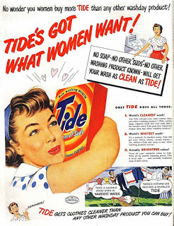
- The font is bright red, Sans serif font, matching the product which makes it pleasing to the eye and catchy. - Background is white - suggesting purity and the cleanliness of the product - The woman holding/hugging tide is the centre image emphasising how it is the crucial to her life - It uses the stereotype that woman are the ones who clean = sexist - the writing is in red associating with woman - red can also be associated with romance. - The woman is happy which shows to the audience that if they buy this product they will also be happy - The words that want to be emphasised are put into bold red colours to show the product - There is a comic print in the bottom right to make the advert more engaging. - Mode of address is talking directly to women "No wonder you Women buy more TIDE" so like a man talking to a woman. - Use of a Z line - starts at top with how good tide is, then main photo of woman and then writing at the bottom. - There is a significant amou...

